Web Design Project: Fernscape Interiors
*Mock project for school
Fernscape Interiors was a fictious client who wanted a website built from scratch. They wanted to showcase who they are, what services they provide, and to give a quick way for customers to reach out - and that is exactly what they got. Crisp and clean colors, pops of green and neutral tones, playful yet modern typography, pops of animation, and accessible throughout.
If living in a jungle was as easy as they would make it, I would totally do it.
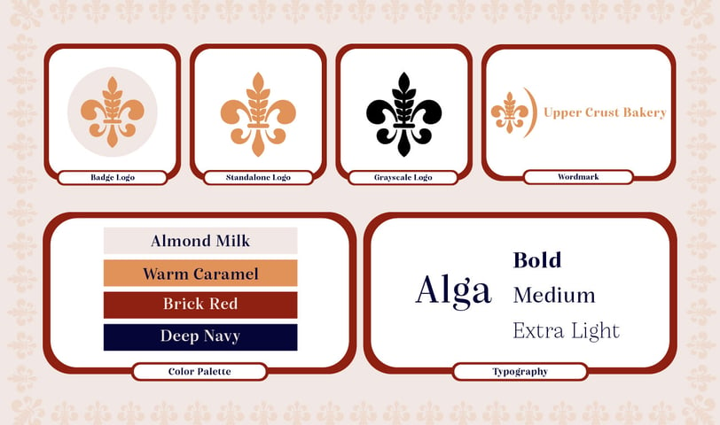

Branding Project: Upper Crust Bakery
*Mock project for school
Upper Crust Bakery was a fictious client who was desiring a new logo and brand package for the opening of their French inspired bakery. They desired a logo and aesthetic that truly captured the essence of Paris as well as appealed to the higher class. The Fleur De Lis is a symbol of French royalty, and many times is associated with perfection. My inspiration was found in this symbol, and thus the Wheat De Lis was born. This is a logo that embodies everything the client wants, and it is versatile (can be used as a badge, standalone or wordmark logo). The color palette was chosen to be warm and inviting while also capturing France through the use of a shade of red, and a shade of blue, although they are not the true colors of the French flag - they still work to give honor to the country, as well as work with the elegant primary colors of Almond Milk and Warm Caramel (fitting colors - wouldn't you agree?).
Alga is a wonderful typeface for this brand. It is so refined, legible and elegant without being so formal that it is unapproachable.

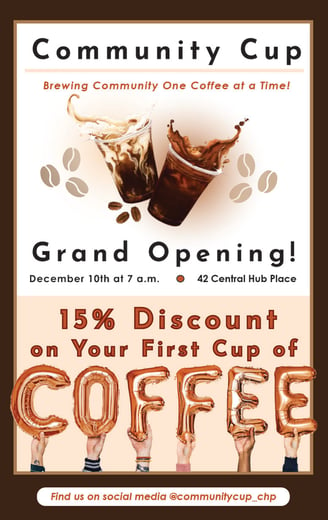
Promotional Project: Community Cup Coffee
*Mock project for school
Community Cup was a fictious coffee shop that was seeking a promotional flyer for their grand opening. Their requirements? Be engaging, have a strong call to action, make them come in for a cup of coffee! They wanted to show that they really meant community - and that's what I gave. From the subtle imagery of two coffees together, as if you're grabbing coffee with a good friend, to the imagery at the bottom of people joined together - for the name of coffee itself.
Matter of fact, I could go for a cup right now!
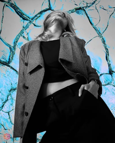
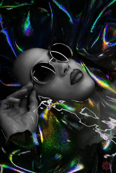
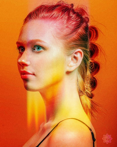
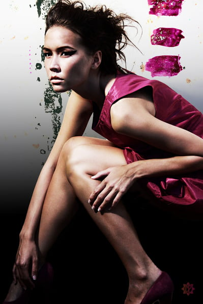
Personal Projects
Now, here is a sample of my free time. I love to mix and morph, adjust and edit, and explore the potentials of what could be considered a simple stock photo. I can absolutely play by the rules and deliver results, but deep in creative expression is my favorite place to be.

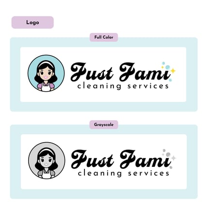
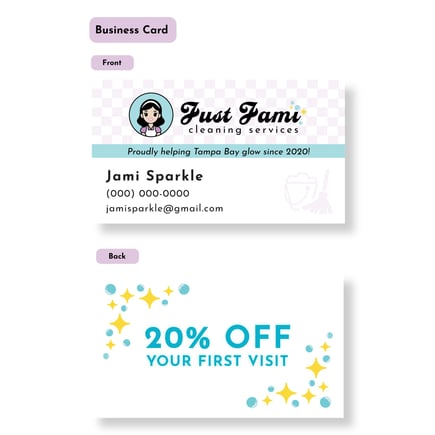
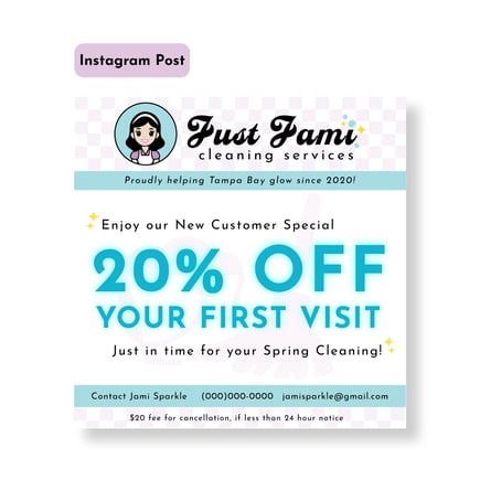
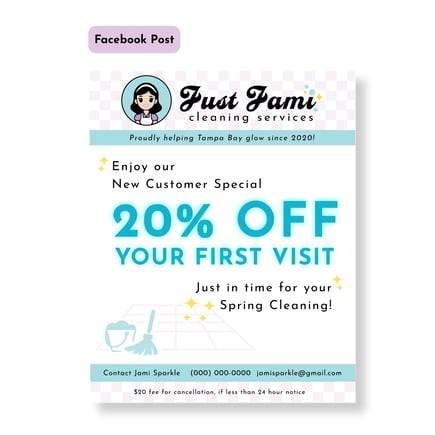
Branding & Social Media Promo Project: Just Jami Cleaning Services
*Real Client
Just Jami Cleaning Services came to me as a start up looking for a fresh logo, business card, and two social media posts (Facebook and Instagram). They were inspired by a 1950s retro look, and gave me tons of creative freedom on these designs. I enjoyed making a cute avatar that represented Jami, and creating a nice script wordmark that really catches the attention, especially with some bubbles and sparkles at the end. I went with a nice and bright cyan, deep lilac, and a pop of yellow based on the client's original concept. For the typefaces, I went with Casey for the script and Josefin Sans. The two typefaces work well together, and the script gives a classy touch without being overpowering or illegible. With a bit of nostalgia, it makes for a perfect cleaning company brand that is sure to instill confidence!