
Upper Crust Bakery
Logo Design | Branding
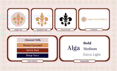
I developed the complete brand identity for Upper Crust Bakery, a fictional French-inspired bakery concept, using Adobe Illustrator to craft the “Wheat De Lis” logo by merging a stylized fleur-de-lis with wheat motifs. This custom emblem plays with line, shape, and form to feel both elegant and organic, and works seamlessly as a badge, standalone mark, or paired with the wordmark. I established a refined palette, soft red and deep navy-blue nodding subtly to the French flag, balanced by Almond Milk and Warm Caramel for warmth, and set type in the Alga family to marry readability with an elevated look. In laying out brand direction, I applied contrast and hierarchy in color blocking, used white space around the emblem to emphasize its regal roots, and repeated wheat patterns to introduce rhythm and unity without overwhelming the design.
Although this was a speculative project, I treated it like a real-world brief by conducting two rounds of critique. I iterated stroke weights and fine-tuned color values for clear legibility in both print and digital contexts. To further elevate this design, I adjusted to logo layout to present a cleaner design using a combination of the badge style logo and wordmark. Final assets include vector logo files, a complete color palette, and typography guidelines. Every detail demonstrates polished craftsmanship and captures the timeless, boutique-bakery elegance I set out to create.