
Town
Print Design
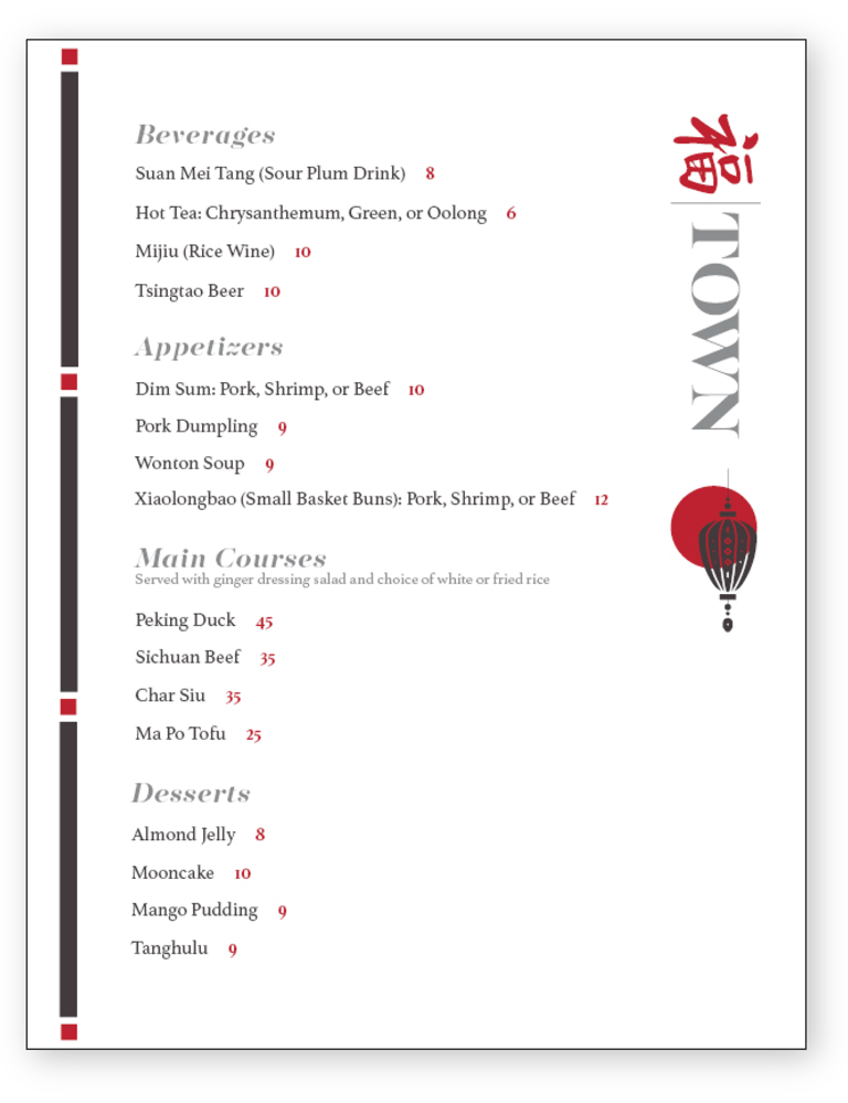
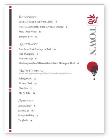
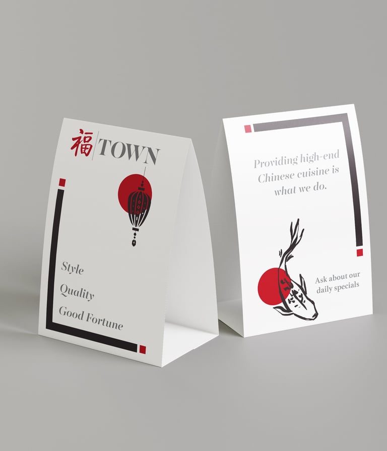
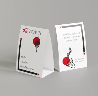
I developed the visual identity for Town, a mock-client upscale Chinese restaurant, by crafting a custom dine-in menu and matching table tent entirely in Adobe InDesign. Starting with a clean, minimal layout, I integrated subtle koi fish and paper lantern illustrations drawn from traditional symbols of prosperity, then applied a modern grayscale palette punctuated by the restaurant’s red signature to highlight key sections. Through careful use of white space, alignment, and typographic hierarchy, I ensured each dish name and description remains legible and inviting, while the red accents guide the diner’s eye to specials and calls to action. The combination of sleek vector accents and restrained typography delivers a refined, high-end aesthetic that feels both contemporary and culturally resonant.
After looking over everything initially, I refined the balance between grayscale elements and red highlights, adjusted margins for consistent gutter spacing, and optimized paragraph styles for seamless updates. Final deliverables include print-ready files with bleeds and crop marks for both the menu and table tent, alongside packaged InDesign assets with linked high-resolution imagery and style guides. Every element, from the culturally informed accents to the precise grid alignment, reflects thoughtful craftsmanship and proficiency in InDesign, resulting in a polished, meaningful brand experience.