
SENIOR VOICE AMERICA (PUBLICATION)
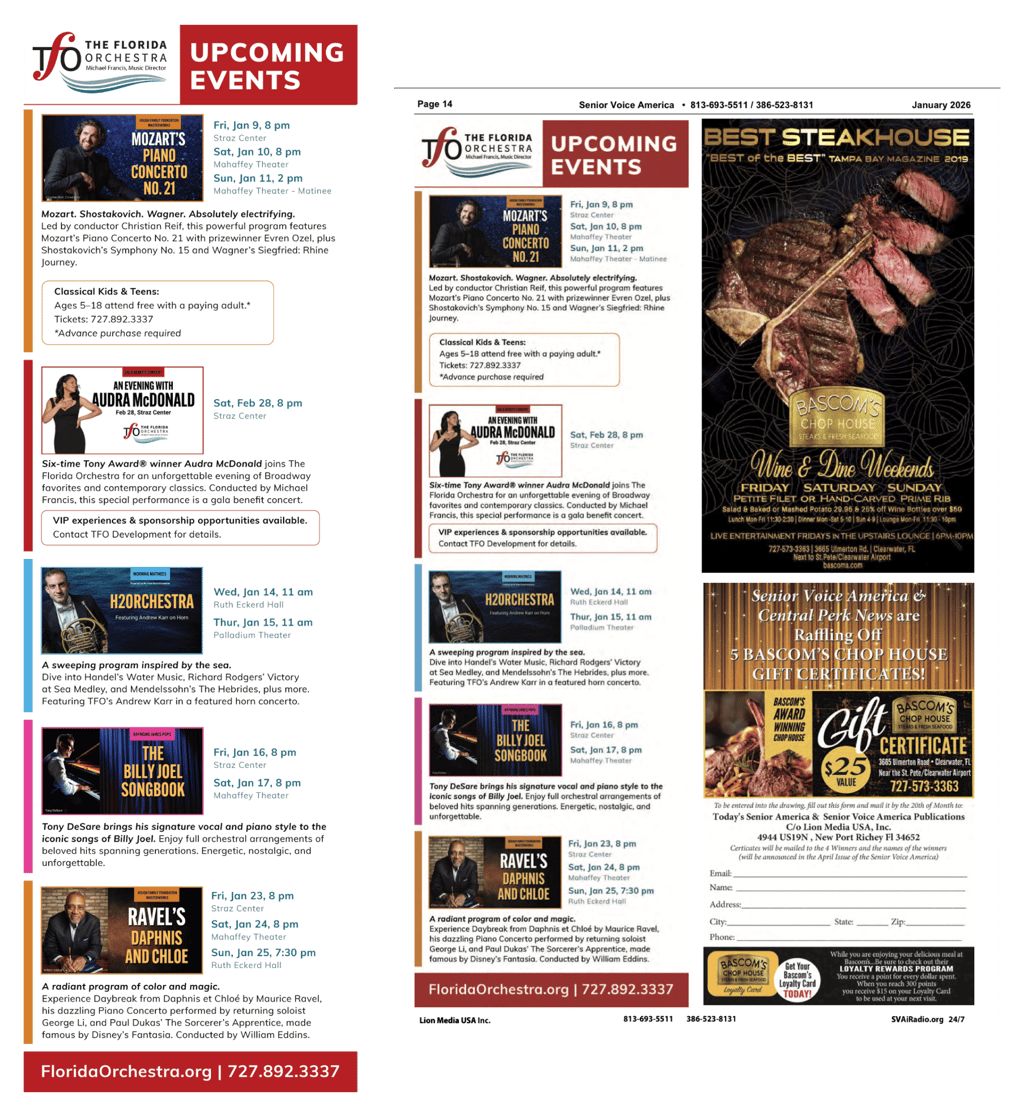
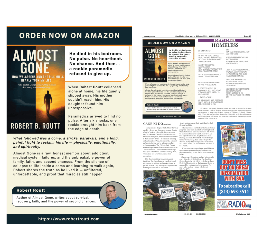

CHALLENGE: Create clear, high-impact print advertisements for Senior Voice America that effectively communicate time-sensitive offers and event information to an older demographic, while maintaining readability, trust, and visual clarity across multiple publication formats.
The ads needed to balance dense informational content with strong hierarchy, ensuring messages were easy to scan, accessible, and visually engaging in a traditional print environment.
SOLUTION: I designed a series of print advertisements with a strong emphasis on clarity, hierarchy, and audience-first design, including:
Strategic layout systems that prioritize headlines, key offers, dates, and calls to action
High-contrast typography and generous spacing to support legibility for senior readers
Visual structure that guides the eye naturally through longer blocks of content
Brand-aligned color usage to differentiate sections while maintaining cohesion
Clean integration of imagery, logos, and promotional messaging without visual clutter
Each ad was optimized for print specifications and designed to perform effectively in newspaper and magazine placements.
RESULT: A set of polished, easy-to-navigate print ads that communicate complex information clearly and confidently, supporting Senior Voice America’s outreach efforts while maintaining credibility and professionalism.
The final designs improved message clarity, enhanced visual consistency across campaigns, and ensured the advertisements were both accessible and engaging for the target audience.
Contact
contact@caitlinprovenzano.com


© Caitlin Provenzano | 2026