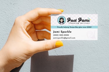
Just Jami Cleaning Services
Branding | Print | Social Media
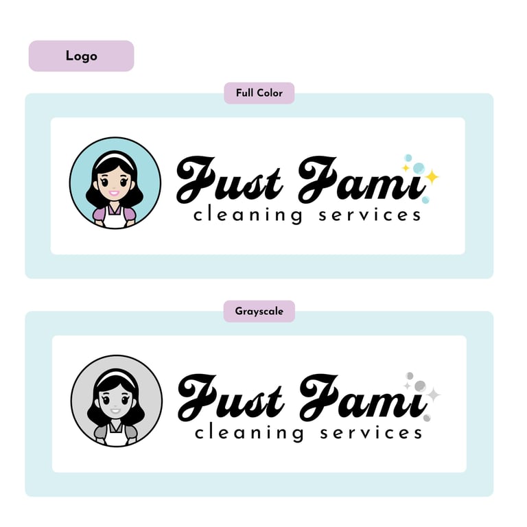
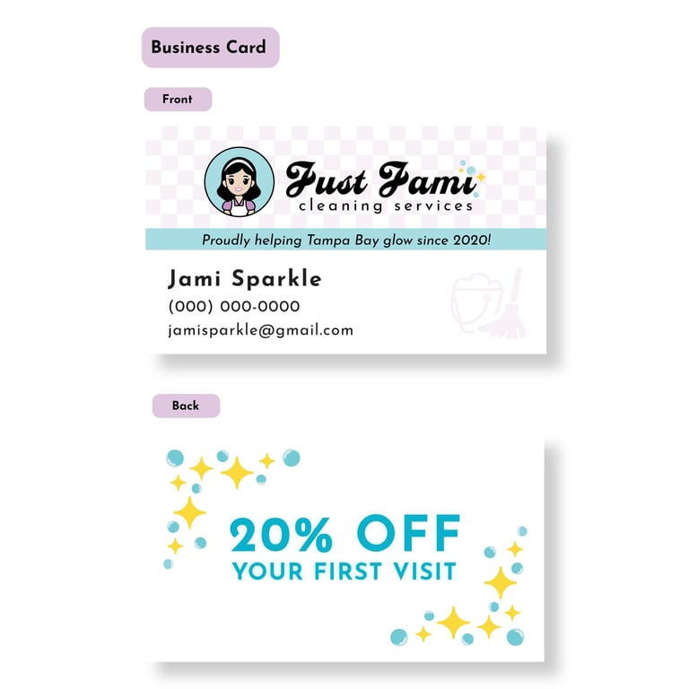
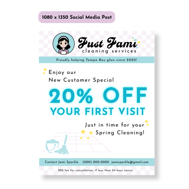
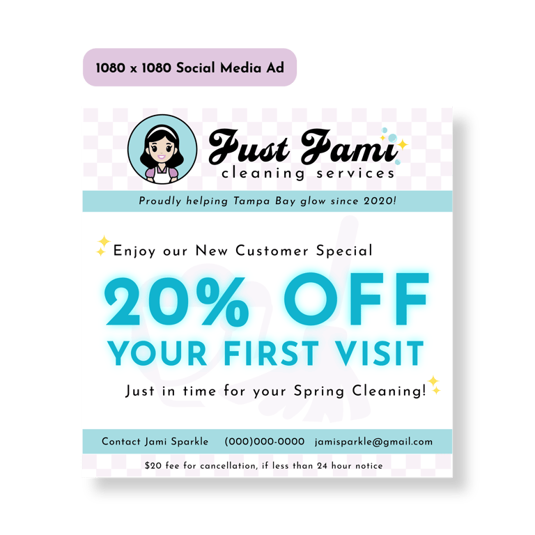
I led the branding for Just Jami Cleaning Services, a real startup client, from concept through final deliverables entirely in Adobe Illustrator, crafting a playful illustrated avatar of Jami and a custom script wordmark in Casey balanced by clean Josefin Sans. To evoke a 1950s retro vibe, I added bubbly sparkles and rounded letterforms, then developed a fresh palette of bright cyan for focal points, deep lilac for secondary elements, and pops of yellow to guide the viewer’s eye. In designing the logo variations, business card, and two social graphics, I applied solid principles of contrast, hierarchy, and white space. Consistent gutters and a simple grid kept layouts orderly while custom vector details lent each piece originality without clutter.
Throughout this client project, I ran two feedback rounds: one with peers to ensure the avatar remained recognizable at small scale and one with the client confirming the tone matched her vision. I iterated stroke weights, adjusted bubble sizes, and refined color values to guarantee legibility in both CMYK-ready business cards with bleed and crop marks and RGB-optimized social posts. Every element, from kerning in the wordmark to the pixel-perfect sparkle icons, reflects thoughtful craftsmanship and a nostalgic yet modern brand that truly stands out in the cleaning services space.