
Amethyst Bay Resort & Spa
Photo Editing | Publication Design
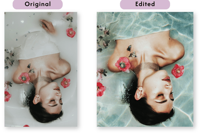
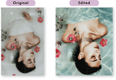
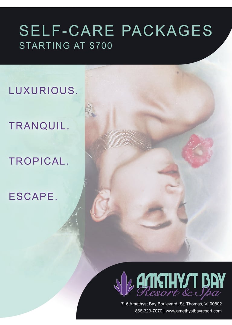
I developed a mock-client ad for Amethyst Bay Resort & Spa, a fictional luxury getaway in St. Thomas, by transforming provided brand assets into a clean, magazine-ready layout. In Photoshop, I enhanced the stock image’s vibrancy, refined highlights, and overlaid a custom water-ripple effect to evoke sunlit tropical waters. Then, in Illustrator, I built the ad around their existing logo, color palette, and fonts, using soft gradients, rounded corners, and drop shadows to introduce subtle depth while maintaining an airy, relaxing feel. I balanced white space and typographic hierarchy so that the resort name, headline, and call-to-action stand out clearly, all within a restrained, high-end aesthetic.
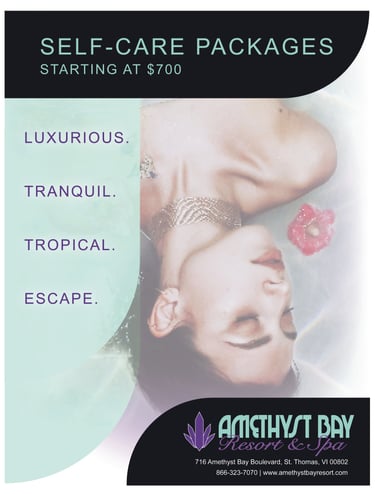
After the initial mockup, the design underwent a targeted redesign to improve organization, adjusting column widths, gutter spacing, and repositioning key elements for smoother flow. Additionally, I aligned tone and layout, then fine-tuned gradient transitions, text alignment, and image cropping based on that feedback. Every element, from precise grid alignment to the color-corrected imagery, demonstrates thoughtful craftsmanship and proficiency in Photoshop and Illustrator, resulting in an inviting, polished ad concept.